


please send a mail
-->here<--
Power Spectral Density computation (Spectral Analysis)
MicroJob Package Deal Service PD001A/B(Copyright Cygnus Research International (Apr 20, 2015))
Page 2 of PD001A/B User Guide
Table of Content
(1) Summary of PD001A/B
(1-1) What this Package Deal service, PD001A does
(1-2) What PD001B does
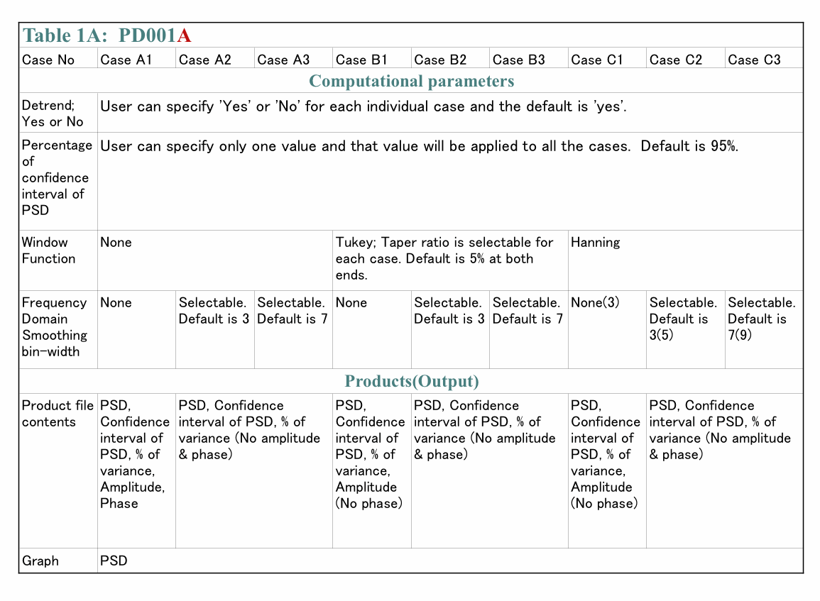
(1-3) Summary of selectable computational parameters
(1-3-1) Detrending data (Applicable to all cases)
(1-3-2) Confidence interval percentage (Applicable to all cases)
(1-3-3) Taper ratio of Tukey window (Applicable to cases B1, B2 and B3 only)
(1-3-4) FDS bin-width (Applicable to all cases except for cases A1, B1 and C1)
(1-4) Computational procedure
(1-5) Your Data (Input data)
(1-6) Products
(1-6-1) Data file (Product file)
(1-6-2) Graphs (Figures) in PDF (PD001A only)
(1-7) Price and ordering procedure
(1-8) Confidentiality
(2) Detail of the product
(2-1) Product files
(2-1-1) Format of Product file
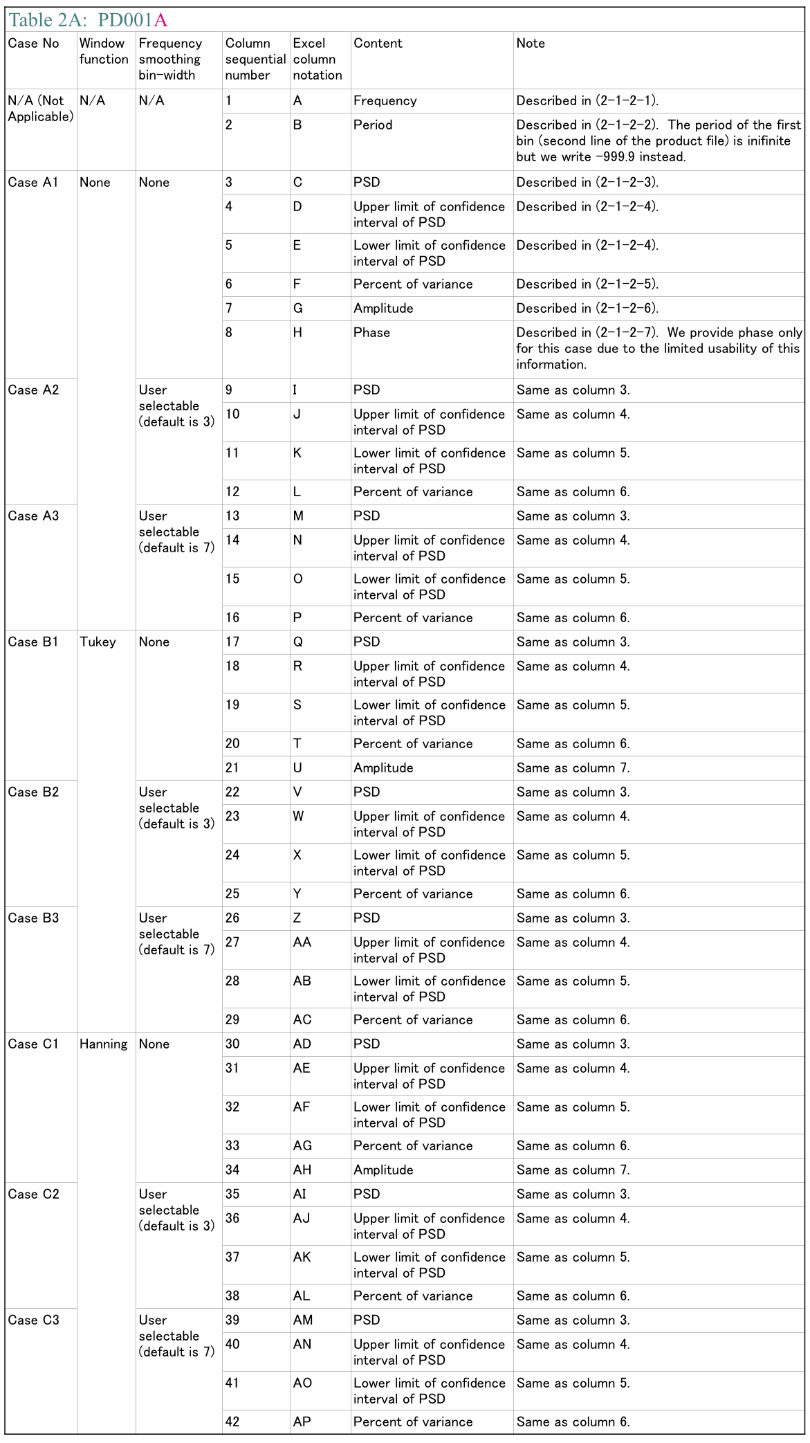
(2-1-2) Explanation of contents of product files
(2-1-2-1) Frequency
(2-1-2-2) Period
(2-1-2-3) PSD
(2-1-2-4) Confidence interval of PSD
(2-1-2-5) Percent of variance
(2-1-2-6) Amplitude (Amplitude spectrum)
(2-1-2-7) Phase
(2-1-3) How to use/interpret data in our product file
(2-1-3-1) Drawing graphs
(2-1-3-2) PSD and Confidence interval of PSD
(2-1-3-3) Estimating amplitude of variations at specific frequencies using amplitude spectrum
(Case 1) When the signal is a sinusoid and the amplitude of it is constant or almost constant in time
(Case 2) When the signal itself is not a sinusoid but the composition of sinusoids of various frequencies
(Case 3) When the signal is sinusoid but the amplitude of the signal varies in time
(Case 3-1) Variation of amplitude itself is sinusoidal
(Example 1) Amplitude of sinusoidal oscillation of frequency f0 varies sinusoidally. Frequency of amplitude variation is f1 and f1 is smaller than f0. Both f0 and f1 are constants.
(Example 2) Amplitude of sinusoidal oscillation of frequency f0 is summation of a constant and a sinusoidal variation of frequency f1.
(Case3-2) Amplitude of sinusoidal oscillation of frequency f0 varies but that variation does not resemble to a sinusoid.
(Case4) When the signal is periodic but the signal does not look like a sinusoid
(2-1-3-4) Obtain some idea how strong the variations within a specific frequency range are.
(2-1-3-5) Construct digitally filtered time series data
(2-1-3-6) Alternative method of amplitude estimation
(2-2) Graph
(3) How to prepare data for this package
(4) Guide for setting proper selectable parameters
(4-1) Detrending and removing average; Yes or No? Default setting is Yes.
(4-1-1) What is detrending? Why do we have to do that?
(4-1-2) Example of detrending
(4-1-3) When detrending becomes harmful
(4-2) Taper ratio of Tukey window; 0~100(%) Default setting is 10%
(4-2-1) Why we need to apply a window function
(4-2-2) What does window function do
(4-2-3) Why Hanning window is not necessarily a good solution
(4-2-4) Why we provide non-windowed and Tukey windowed result for PD001A
(4-2-5) The method to reduce dumping near the both ends of data while still using Hanning window
(4-2-6) Implicit FDS
(4-2-7) Implicit FD'Smoothing' Really?
(4-2-8) Reduction of PSD and amplitude due to the window
(4-2-9) Does correction of reduction of PSD work well?
(4-2-10) Tukey window; how taper ratio affects its characteristics
(4-3) Bin-width of FDS; 1,3,5,7,... (Odd integer); Default setting is None, 3 and 7
(4-3-1) FDS works well for PSD
(4-3-2) FDS does NOT work well for amplitude spectrum
(4-3-3) Frequency resolution when we applied FDS
(4-3-4) Alternative method of FDS
(4-4) Percentage of confidence interval; any positive value larger than 0.0 and smaller than 100.0; Default is 95.0
Appendix 1; About numerical error generated by computers.
Appendix 2; Spectral leakage of power spectrum density function and window functions.
Appendix 3; Why we see a single peak instead of twin-peaks when data length is short.
Appendix 4; How the frequency of S1 affects the detectability of SR
(2-1-3) How to use/interpret data in our product file
We explain how to use and/or interpret data we write to our product file in this section.
(2-1-3-1) Drawing graphs
Let us assume we want to draw a graph of PSD computed by PD001A. The first thing we need to do is importing our product file into an application for drawing a graph. If we use Excel, all we need to do is just double clicking a product file name. If we want to use some other applications, it might be easier if we remove first line (header) of our product file. We can do that easily using almost any text editor because our product file is just an ASCII text file. Once we have imported our product file into our favorite application, we need to select variables in order to draw a graph. Now let's say we want PSD with no FDS but Hanning window is applied to be a variable of vertical position (often referred as "y") and the frequency to be a variable of horizontal position (often referred as "x"). Then, Table 2A shows us that we need to select the first column of data to be horizontal position data and the 30th column of data (Case C1; No FDS, Hanning window) to be vertical position data. After selecting appropriate columns we just draw a graph.
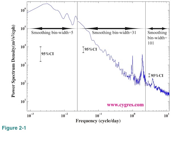
As we will describe in (2-2) it would generally be better if we use logarithmic scaling when we draw a graph of PSD. It is fairly common that PSD varies a lot at high frequency range. If we use the result of PD001A, we might get better overall picture by making a graph using the result with narrow bin-width FDS (Table 1A; cases A1, B1 and C1) at low frequency range, intermediate bin-width FDS (cases A2, B2 and C2) at middle frequency range and wide bin-width FDS (cases A3, B3 and C3) at high frequency range. In Figure 2-1 we combined PSDs with three different bin-width FDS and drew vertical solid lines at boundaries. Since the height of 95% confidence interval changes with FDS bin-width we drew three of them. Please compare this graph with Figure 1-1(b) where the FDS bin-width is 7 across the entire frequency range. The easiest way to apply this method is by creating a new column of data by synthesizing part of existing columns of data. Copy and paste functions of Excel are very handy for that task.
(2-1-3-2) PSD and Confidence interval of PSD
In the following we assume that we use the results computed by PD001A but general idea is relevant even if we use the results computed by PD001B.
First of all, we do not need to pick up any specific PSD but discard all other PSDs PD001A provides. We can use PSD of cases A3, B3 and C3 to see overall characteristic across entire frequency range. If there are noticeable differences between PSDs of cases A3 and C3 even if bin-widths of FDS are not that much different, usage of Hanning window might not be appropriate as we will describe in (4-2-3). Otherwise, using PSD of Case C3 would make it easier when we need to present PSD to someone because all we need to say about the method we use is that "it is widely used method". To see the detail of PSD, we can use PSDs of cases A2, B2, C2 and possibly B1 and C1. PSDs of Case A1 and Case B1 might become handy when we want to know the frequencies of signals (peaks) as precisely as possible because of their high frequency resolutions although we need some cautions to use them as we will describe below. When we use PSD to which FDS is applied (all cases except for cases A1, B1 and C1), we should not forget that values of PSD will be reduced because frequency resolution will be widened as we will describe in (4-3-1).
In general, professional statisticians do not use PSD of Case A1 (no-window, no-FDS) and Case B1 (Tukey window; assumes default taper ratio, no-FDS). Detailed explanation of the reason of this is far beyond of the scope of this document and we only present very simplified explanation. First of all, statisticians assume there are many data sets other than what we have and these many other data sets, in some cases hypothetical, have the same statistical characteristics. The way statisticians look at our computed PSD is that it is just one of the possible PSDs of those many data sets. Along this line, then statisticians would call our computed PSD "estimated" PSD but not "true" PSD. It does not matter if other data sets can actually exist or not. Since our computed PSD is just an "estimation", statisticians would expect that our computed PSD includes "error". In cases of PSDs of Case A1 and Case B1 (assumed default taper ratio), the statistical theory says that magnitude of "error" can be comparable to that of "estimated" PSD itself. That is why statisticians would not use PSDs of Case A1 and Case B1. FDS is one of the methods to improve accuracy of "estimation" by sacrificing frequency resolution (Please see (4-3-3)) and statisticians would recommend us to use PSD of any cases PD001A provides except for Case A1 and Case B1. Here, the uncertainty of "estimation" or "error" comes from differences among data sets but not from a computational method. The computational error we will describe in Appendix 1 is not relevant here. If there were no such thing like uncertainty in our data, using PSDs of Case A1 and Case B1 will not be a problem. A typical example of this case is our test data shown in (2-1-3-3), which contains single fixed frequency sinusoid but nothing else. Also, it might be reasonable to use PSDs of Case A1 and Case B1 to take an advantage of highest possible frequency resolution in certain cases such as when we have a record of something during a specific incident and we want to investigate that incident alone but have no intention to extend our conclusion beyond of that incident.
If we ignore statisticians' point of view, we also should ignore confidence interval of PSD because computation of confidence interval assumes existence of "error", which can only be described by statistical terms. In cases such as when we have a record of something and we want to describe general characteristic of that something using a record we have, then, it does make sense to respect wisdom of statisticians. In that case, we are actually trying to guess the "true" PSD using a sample we have. Whether we accept the statisticians' point of view or not, we believe there is a merit to have PSDs of Case A1 and Case B1 because, at least, we can use them as references. We can also use them to apply different forms of FDS later if we wish to do so.
There are some arbitrariness regarding the usage of confidence interval of PSD but the typical way is as follows. Figure 2-2(a) shows very noisy (or hairy or spiky) but flat PSD. We picked up the largest peak, A, and the second largest peak, B, in this graph. The question here is that whether these peaks are something special so that we need to reckon with or are they just the same as other peaks so that we can ignore them. A typical way to answer this question is to see whether the height of these peaks is large compare to others or not. Then, the first thing we need to do is to decide what the height of others is. We will call the height of others the "floor" from now on. We have chosen average of the upper limit of 95% confidence interval across the entire frequency range to be a floor in our example. One of the arbitrariness is here. We can think of many other ways to define a floor. For example, the average of PSD itself across the entire frequency range can be a floor. Or adding standard deviation of PSD multiplied by three to the average of PSD and then we can call that value a floor. We might restrict our averaging interval only near the target peak because PSD may not be as flat as PSD shown in Figure 2-2(a). Or assuming there exist a specific distribution of PSD caused by background noise and we call that "noise PSD" a floor. We determine a floor rather casually in some cases as we will show next. The important thing is that in whatever the way we define a floor, it must be a reasonable one. We usually take a look at graph of PSD (such as Figure 2-2(a)) before determining how to define a floor.
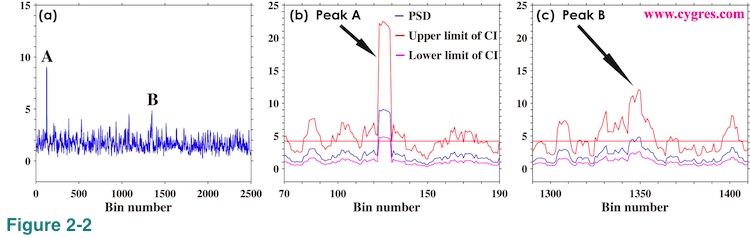
Figure 2-2(b) shows PSD (blue), upper limit of 95% confidence interval (CI) of PSD (red) and lower limit of 95% confidence interval of PSD (purple) near the peak A. The horizontal straight red line indicates the floor. This graph shows that the lower limit of confidence interval (purple) of peak A is higher than the floor (red horizontal line). In this case, we will say that there is a 95% chance that the peak A is significantly higher than the floor. In case of peak B, Figure 2-2(c) shows that the lower limit of confidence interval is below the floor although the value of PSD is slightly higher than the floor. In this case, we cannot say peak B is significantly higher than the floor. Thus, we will only pick up peak A for further study in this example because heights of all other peaks are less than the height of peak B. Finally, when we use a window function, we modify a value called degree of freedom to compute confidence interval.
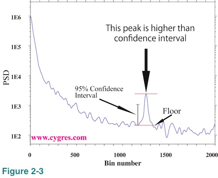
Using logarithmic scaling for vertical axis may become very convenient in some cases unlike linear scaling shown in Figure 2-2 where the visual distance between upper and lower limit of confidence interval on the graph is not constant but depends on the value of PSD. If we use logarithmic scaling visual distance on the graph between upper and lower limit of confidence interval is constant as long as we do not change bin-width of FDS. For that reason we show just one vertical bar in Figure 1-1(b) and three vertical bars, one for each segment, in Figure 2-1 to show confidence interval. We can move any of these bars in Figure 2-1 and it still shows a correct confidence interval as long as we keep it within its own frequency segment bounded by vertical black solid lines.
Figure 2-3 shows an example of how to use confidence interval on logarithmically scaled graph. If we draw upper and lower limit of confidence interval like Figure 2-2(b), the visual vertical distance between these limits is the same anywhere in this graph. The short vertical black solid line with a hat at both ends labeled "95% Confidence Interval" shows this vertical distance. This graph shows that there is only one peak, height of which exceeds the confidence interval. The heights of all of the other peaks and bumps are shorter than the confidence interval. In this particular example, we determined the floor of this peak visually without any computation unlike before.
Generally speaking, it is not a good idea to rely on computed confidence interval too much to find meaningful peaks on PSD. The ways we typically use confidence interval as shown above only utilize general statistical theory but there is no consideration of actual mechanisms that control variations in our data. There is no guarantee that peak A is actually meaningful and peak B is not. It might be better if we use confidence interval only to justify our choice when we pick up any specific peak appearing on PSD.
(2-1-3-3) Estimating amplitude of variations at specific frequencies using amplitude spectrum
It seems to us that quite a lot of information about PSD is easily available on the Internet but information about amplitude spectrum is relatively limited. It is not necessarily rare to hear pessimistic comments such as "PSD computation is good for finding frequencies of prominent variations but not suited to get their amplitudes". We do not necessarily disagree with comments like that but, then, it might not be as bad as that kind of comment suggests in certain cases. It seems to us that it is important to know about the limitation of the information about amplitude available from PSD computation. Therefore, we will spend some spaces in this document about actual computational accuracy of amplitude spectrum. Here and in the rest of this document we call the variation we wish to pick up, a signal. We call anything else, a noise. In the following we show how amplitude spectrum look like when we have some specific types of signal but no noise. We will show some examples when we have noises in (2-1-3-5).
(Case 1) When the signal is a sinusoid and the amplitude of it is constant or almost constant in time
This is the simplest case. Figure 2-4(a) shows time series of test data, which contains a single fixed frequency signal but nothing else. We should admit that this is an unrealistically idealistic case but it makes certain important features quite clear. Horizontal axis is the data length (number of data multiplied by sampling interval). We use one period (=1/frequency) of a signal for the unit of horizontal axis for convenience. Actual data starts from 0.0, but the computational result using data shorter than one period is quite confusing and thus we omit that part in this graph. The sampling interval of the data is 1/1000 of one period of a signal. This means that number of data is 2000 if data length is 2.0 in Figure 2-4(a), for example.
Before getting into the detail, let us define "signal bin" for our test cases. As we described in (2-1-2-1), the central frequency of a specific bin is the frequency we write in our product file and the frequency coverage of that bin is from the central frequency of that bin minus half of a frequency resolution (lower limit) to the central frequency of that bin plus half of a frequency resolution (higher limit). A signal bin is the bin, frequency coverage of which includes signal frequency. The central frequencies of bins, where PSD and amplitude spectrum are computed, are automatically determined by data length (horizontal position in these graphs) and sampling interval as we described in (2-1-2-1) and we cannot choose arbitrary frequencies. When we write "frequency of signal bin" we mean central frequency of signal bin. The frequency of signal bin is not necessarily equal to actual signal frequency. Likewise, the amplitude of signal bin is the estimated amplitude of signal using PSD computation and it is not necessarily equal to actual signal amplitude.
Figure 2-4(b) shows variations of amplitude of signal bin as we add more data and actual signal amplitude 1.0 is shown as horizontal solid black line. Please note that this and graphs below this one are not simple time series plots unlike Figure 2-4(a). Values at horizontal position 2.0 are the results of PSD computation when we use 2x1000=2000 data and values at horizontal position 3.0 are the results of PSD computation when we use 3x1000=3000 data. There are 500 computaional results within one horizontal unit in these graphs. We will show amplitude spectrum and PSD at horizontal positions marked by vertical blue lines labeled A, B and C in Figure 2-4(b) later.
Here and in many parts of this document we intentionally removed unit from PSD and other computed values. The vertical dashed lines in these graphs are drawn where the frequency of signal bin matches the actual signal frequency. In the rest of this document when we write 'frequency match', we mean that the frequency of the signal bin matches frequency of actual signal.
Figure 2-4(c) shows amplitude of signal bin only at horizontal positions where this frequency match occurs. Figure 2-4(d) shows how the variance of data fed to PSD computation varies as we add more data. Figure 2-4(e) shows the frequency of signal bin and the horizontal black line in this graph indicates actual signal frequency. Figure 2-4(f) shows bandwidth of a bin, which is equal to a frequency resolution. This value shows the range of possible error of frequency estimation (difference between frequency of signal bin and actual signal frequency). As we add more data, bandwidth becomes narrower and frequency estimation becomes more accurate. The reduction rate of bandwidth is initially large, but it decreases rapidly. Finally, we would like to note that we did not apply detrending for the reason we will describe in (4-1-3) for these computations.
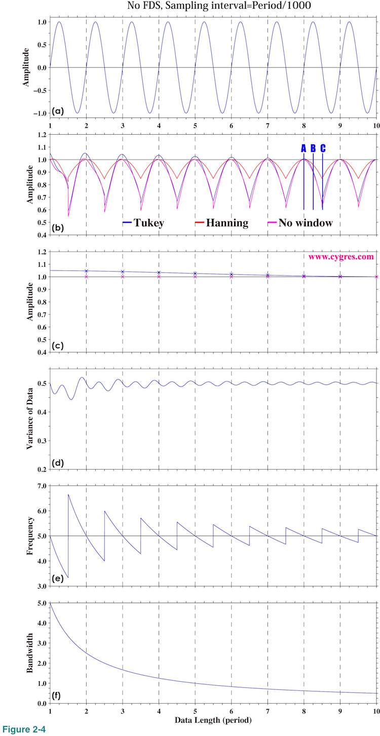
Now, let us return to Figure 2-4(b). This graph shows that amplitude of signal bin is closest to the actual signal amplitude when frequency of signal bin matches frequency of actual signal (frequency match), occurrence of which is indicated by vertical dashed lines. The amplitude of signal bin becomes smaller than actual signal amplitude if frequency does not match. From equation (3) in (2-1-2-6), if frequency matches, only one Am in equation (3) has non-zero value and that value is equal to actual signal amplitude and all other Am's are zero if we do not apply a window function. If we apply a window function, amplitudes of bins other than signal bin become non-zero even if frequency matches as we show later.
Amplitude of signal bin becomes smaller when frequency does not match because we force PSD to compute amplitude at frequency, which is not equal to actual signal frequency. In that case, a phenomenon called spectral leakage occurs. Equation (3) shows that signal bin alone cannot represent actual signal because frequency of it does not match actual signal frequency and other bins are needed to hold this equation. We will provide more mathematical explanation about spectral leakage in Appendix 2.
The maximum amplitude occurs at the signal bin most of the time but there are cases when the maximum amplitude occurs at the bin next to the signal bin. Situation like that tends to occur when the signal frequency is close to the upper or the lower boundary of signal bin (blue vertical line C). In the cases shown here, 84, 19 and 136 results among 4501 computational results have the maximum amplitude at the bin next to the signal bin when we applied Tukey or Hanning window and when we did not apply any window, respectively. We will describe the reason why bin of the maximum amplitude does not necessarily coincide with signal bin in Appendix 2.
To achieve frequency match we usually adjust number of data when we compute PSD. As we described in (2-1-2-1) PSD and other variables are computed at frequencies ranging from 0 to 1/(2 x Sampling interval) with constant interval, 1/(Number of data x Sampling interval). If the signal frequency is f, then we adjust number of data so that f x (Number of data x Sampling interval) will be an integer to achieve frequency match. For example, let assume that signal frequency is 1.5 cycle/second and we have a data set, number of which is 198 and sampling interval of which is 0.5 second. If we use all the data, then 1.5x(198x0.5) is 148.5. This is not an integer and we cannot achieve frequency match. If we remove 2 data and make number of data 196, 1.5x(196x0.5) becomes an integer, 147. Alternately if we add 2 extra zero values to our data and make number of data 200, then 1.5x(200x0.5) becomes also an integer,150. Adding extra zeros to a data set is called zero padding and this method is often used to achieve frequency match.
Figure 2-4(c) shows that we can get fairly accurate amplitude if frequency match is acheived. As of necessary data length to get accurate amplitude, figures 2-4(b) and (c) suggest that more than a few period of signal may be enough. If data contains strong noise, we may need relatively large number of data to get accurate amplitude as we will show in (2-1-3-5), however.
While the variation of computed amplitude starts repeating almost the same pattern once data length reaches to a few period of the signal, Figure 2-4(e) shows that adding more data continuously improves accuracy of frequency estimation. This is because frequency resolution increases (or bandwidth decreases) as number of data increases (Figure 2-4(f)). Caveat here is that, if we add more data, frequency match to get correct amplitude needs to be more precise. The maximum deviation of computed amplitude from actual signal amplitude within each cycle indicated by the depth of "valley" from nearby "hill" in Figure 2-4(b) becomes almost constant toward right while the range of the variation of computed signal frequency progressively decreases as shown by Figure 2-4(e). This indicates that the magnitude of error of computed amplitude depends on the difference between frequency of signal bin and actual signal frequency RELATIVE to bandwidth but not on the difference itself (absolute value). Small frequency mismatch may cause a larger error of computed amplitude if our data is long.
These graphs suggest that the result when Hanning window is applied appears to be the best. The maximum deviations of computed amplitude from actual amplitude between data length 8.0 and 9.0 are about 0.34, 0.15 and 0.38 when Tukey window, Hanning window and no window is applied, respectively. As we will describe in (4-2-2), Hanning window dumps data near the beginning and the ending of data considerably and that might cause a problem in certain cases. However, that would not cause any problem to our test case here because the data contains nothing but only a signal and amplitude of the signal is constant in time. We can get the maximum benefit of Hanning window and loose nothing except that the signal peak in the spectrum is widened as we will describe next.
Now let us show amplitude spectrum. We will show overall picture first and then we will show the detail. Figure 2-5 shows the amplitude spectra when data length is A, B and C (Figure 2-4(b)). We used logarithmic scaling to emphasize variations in small value ranges. Since log of zero is minus infinite, the lowest frequency limit of these graphs is the frequency of the first non-zero frequency (third row of our product file). Frequency match occurs when data length is A. When data length is C, the difference between frequency of actual signal and that of signal bin becomes the largest. The case of the data length B is in the middle of the cases of data length A and C.
Figure 2-5(a) shows that the amplitude spectra have a sharp peak at a signal frequency, 5.0, when we did not apply any window (purple) or we applied Hanning window (red). Values of amplitudes for these two cases at frequencies outside of the signal peak are not zero but very small. Theoretically correct amplitude spectrum when we do not apply any window (purple line in Figure 2-5(a)) is that amplitude is zero except at the signal frequency where amplitude is 1.0 but we will never get zero amplitude anywhere as this graph shows. What we would like to say here is that non-zero amplitude does not necessarily mean there is a variation at that frequency. Non-zero values of red and purple lines we see outside of the signal peak in Figure 2-5(a) are due to small computational errors we describe in Appendix1.
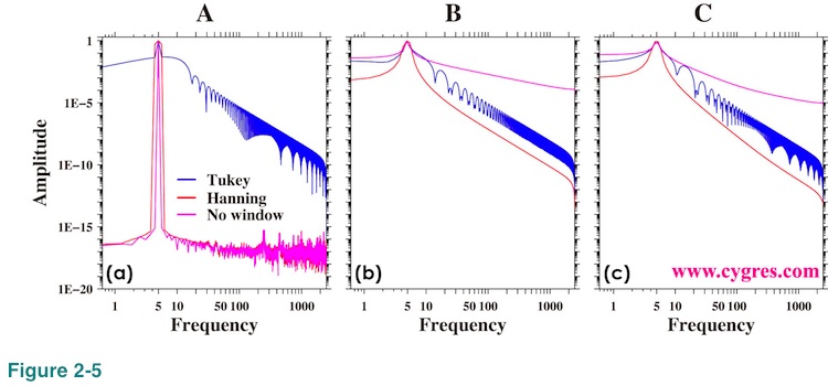
'Bumpy' shape appeared in the result when Tukey window is applied (blue line) in Figure 2-5(a) is due to so called side lobes of Tukey window. This bumpy feature may raise serious concern about using Tukey window but when we apply this window to the real world data, which contains signals and noises at various frequencies, we usually do not see this bumpy feature. If we compute continuous spectrum rather than spectrum at specific frequencies, we will see a bumpy feature even in the case when we apply Hanning window as we will describe in Appendix 2. We will describe more about the effects of window functions in (4-2).
When we cannot achieve frequency match, spectral leakage occurs as we described before. Figures 2-5(b) and (c) show that the amplitudes at frequencies outside of signal peak are considerably larger than those in Figure 2-5(a). This discrepancy is mostly caused by spectral leakage.
Figure 2-6 shows the expanded view of amplitude spectra around the signal frequency (5.0). The plus (+) marks in this graph show the frequency where the amplitude spectra are computed. When the data length is A, Figure 2-6(a) shows that signal appears as a steep single point peak except for the one when Hanning window (red) is applied. The widening of the signal peak when Hanning window is applied is the result of implicit FDS and we will describe detail of that effect in (4-2-6). When data length is B (Figure 2-6(b)) or C (Figure 2-6(C)), signal peaks do not look sharp but this is partially due to the visual effect of logarithmic scaling we used in these graphs.
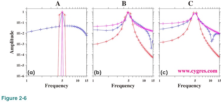
Figures 2-7(a), (b) and (c) are the same graphs as figures 2-6(a), (b) and (c) except that now we use linear scaling. The black horizontal dashed lines show actual signal amplitude. We made these graphs to show the accuracy of the computed signal amplitude. Figure 2-7(d) shows further detail of amplitude spectra at and around actual signal freqeuncy when we do not apply any window function. The black vertical solid line in this graph indicates actual signal frequency and colored asterisks (*) indicate signal bins. We drew colored dashed line connecting bins adjacent to the signal bin. When frequency matches (blue; data length=A), amplitudes at one point left (lower frequency) and one point right (higher frequency) of the signal bin are zero within computational accuracy. The shape of the peak is symmetrical. When frequency of signal bin is lower than actual signal frequency (red; data length=B), amplitude at one point right of signal bin becomes larger than amplitude at one point left of signal bin and peak is no longer symmetrical. The difference of amplitude at one point right of signal bin and at one point left of signal bin becomes larger as frequency of signal bin deviates more from actual signal frequency. When frequency difference between actual signal and signal bin is almost maximum (purple; data length =C), spectrum of signal becomes two-point almost-flat top instead of a single point peak. As we described before, the bin of the maximum amplitude may not be a signal bin and this case is the example of it. The amplitude of the bin marked by purple triangle is about 0.638 and it is larger than the amplitude of the signal bin marked by purple asterisk, which is about 0.636. Although the difference of these two values is small, it is much larger than computational error we described in Appendix 1. Since there is no statistical uncertainty in this computation (data contains only a fixed frequency signal, and amplitude and phase of that signal are also fixed), fact that the amplitude of signal bin is not the maximum is not accidental. Therefore, we cannot determine signal bin by simply looking for the bin of the maximum amplitude in certain cases.
This graph suggests that if the peak of amplitude spectrum is not symmetrical, actual signal exists between signal bin and either left or right of that bin. In general the direction we have to go is determined by amplitudes of those bins; go higher point. However, when we have a two-point almost-flat top rather than a single point peak, signal bin might be a bin, amplitude of which is smaller than another one. As a caveat, we usually have many other signals and noises and it is likely that things are not as simple as the case we have shown here. We will show amplitude spectra when we have noises in (2-1-3-5).
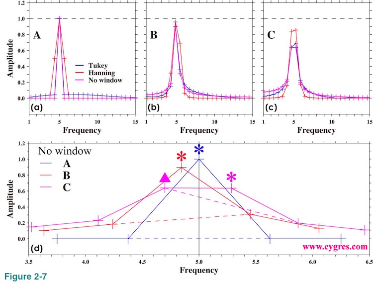
Figure 2-8 shows PSD for the reference. These graphs are visually pretty much the same as Figure 2-5.
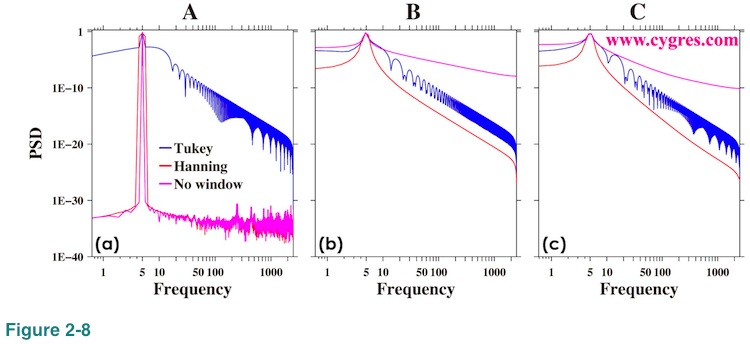
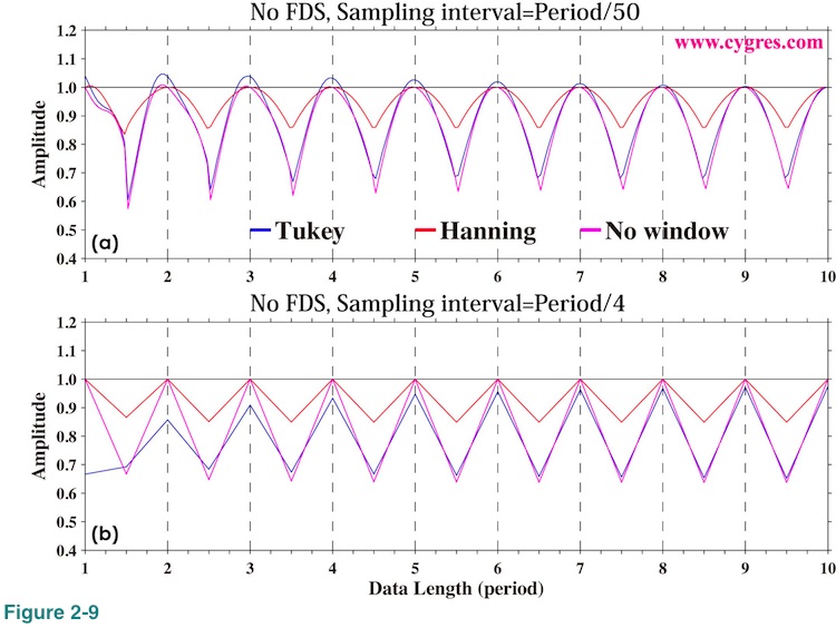
Figure 2-9(a) shows computed signal amplitude just like Figure 2-4(b) when we set sampling interval 100 times longer (100 times lesser data per unit time). This graph looks pretty much the same as Figure 2-4(b). We set sampling interval further longer so that there are only 4 data points within one period and the result is Figure 2-9(b). Except that now we can see where data exists (only 4 points in one period versus 50 or 1000 points in one period), general tendency is the same. While these graphs suggest that we can get fairly accurate amplitude using relatively small number of data, we should not forget that the data we used here contains nothing but a fixed frequency constant amplitude signal. Since there are no statistical variations, these are not statistical estimations. In reality we usually have many other fluctuating signals and noises in our data. Having more data would generally improve statistical computational accuracy. What we have shown here is the result we will never get any better. 'your mileage may vary.' Also, we should not forget that the maximum frequency of PSD computation is determined by sampling interval.
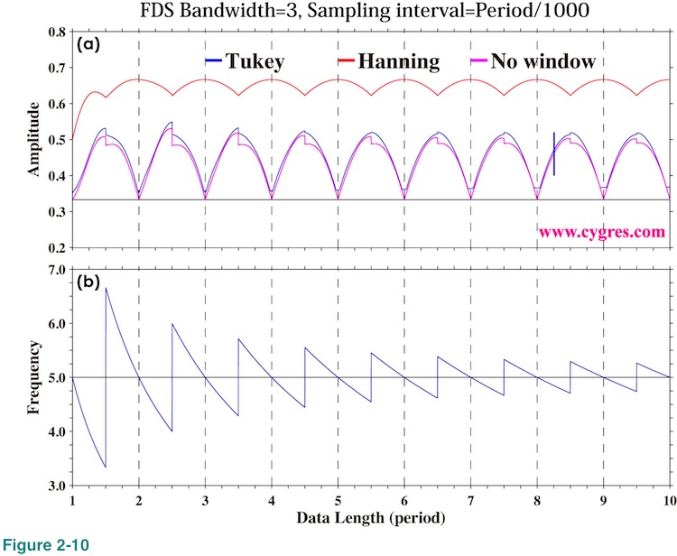
FDS is a simple un-weighted moving average applied to the result of PSD computation. For example, the 3-bin FDS of PSD of bin number k is computed as {P(k-1)+P(k)+P(k+1)}/3, using PSD of k-1th, kth and k+1th bins. In this case, all of PSDs are multiplied by the same constant, 1/3. In other words, PSD(k-1), PSD(k) and PSD(k+1) are all treated equally. This we call "un-weighted" moving average. If we compute 3-bin moving average of PSD of bin number k as {PSD(k-1)+2xPSD(k)+PSD(k+1)}/4 instead, PSD(k-1) and PSD(k+1) are multiplied by 1/4 but PSD(k) is multiplied by 2/4. In other words we treat PSD(k) preferentially over others. This we call "weighted" moving average.
Although FDS works well when we apply it to PSD, it does not work well for amplitude spectrum. Figure 2-10 shows amplitude of signal bin with 3-bin FDS. As above equation indicates, correct amplitude should be 1/3 of actual signal amplitude (black horizontal solid line in the graph). However, this graph shows that the computed amplitude without application of a window function (purple line) gives correct value only when frequency match occurs but gives larger value otherwise. Computed amplitude becomes vastly larger than the correct value when we applied Hanning window. It seems to us that application of FDS to amplitude spectrum would quite likely produces misleading results and thus we decided that we do not include amplitude spectrum when we applied FDS in our product file. We describe more about this topic in (4-3-2).
To read next page, please click right button below.

